Resources
Printing
-
High Res Digital offers the combination of over 40 years of photography and printing experience with a deep understanding of both analog and digital workflows – optimising images and the printing process to get the best possible results.
In 1998 we were at the forefront of introducing Giclée prints to Australia, part of our printing business is Giclée Australia.
We collaborate with artists and photographers in preparing and printing fine art prints, specialising in making artworks and prints be the best they can possibly be. On coated and uncoated medias we strive to stay at the leading edge of print quality. Our prints range from Museum grade to standard Pro-Lab printing at sizes up to 162cm rolls.
Nowadays it’s quite easy to produce reasonable prints whether on your own printer or at a professional laboratory. Many of High Res Digital’s clients can do their own printing but prefer to have their most important (or difficult) images printed by us. They don’t want good – they want the best print possible. For instance when Epson Australia sponsor an event or exhibition such as the Walkley Awards they turn to us to prepare and produce the prints for them. Many of Australia’s leading Photographers, Artists, Photo Educators, Institutions and Art Galleries trust us to print their works or exhibitions and to advise the best printing options available.
Clients love the way they can trust us to take the stress out of the process, knowing we will meet their deadline and knowing we have the experience, care and expertise to make sure all of their images look the best they possibly can when displayed – be it small or large. We bring over 40 years of professional photography and photographic printing experience and we know what a true photographic print should look like – our prints don’t look “digital”, they don’t look “mushy” and they don’t look “plastic”.
We can help with your problem images, clients, exhibitions, deadlines and budgets!
-
An often important part of our process involves offering economical test strips or test prints and also providing a “viewing wall” to asses them on. Our magnetic wall has 3 different illumination options – Solux 4700K lighting, Solux 3500K lighting (considered best all-round) and the latest 3000K LED Gallery lighting. Adjacent wea large GTI Graphiclite 100 D50 colour viewing booth plus standard Halogen lighting as used by many galleries. We will offer help and opinions when assessing your test prints.
-
We will print any size that fits our rolls, the sizes in our price list need only be used as price guides. Paper choices and categories are described in the following section.
We have a minimum charge of $80 per order. All orders must be accompanied by an email confirming contact details, print sizes (including borders) and paper choice. Normal turnaround for prints is 3-5 working days. We can do same day turnarounds for emergency works – some surcharges will apply.
For exhibition work please allow time for consulting, evaluating images and testing if needed – talk to us as early in the project as possible. Many of our existing clients find these early discussions help ensure a smooth workflow, ultimately save time and obtain the best possible final results – it is not uncommon to spend up to a year working towards a major exhibition with some artists.
We have 4 main price categories for papers and no matter which paper category you choose, your print will still be highly archival and beautifully printed.
Our first category includes all of our 50+ Fine Art papers, Backlit and Clear Film and Canvases. Some of our Art papers are available in 162cm rolls in both gloss and matt finishes.
Our next category is for Premium Photo Papers, there are many surfaces to choose from including gloss, pearl, lustre, semi gloss, matt etc. Paper weight is from 250GSM to 310GSM depending upon paper choice.
Our third category is Metallic and High Gloss Film (for a similar look to Ilfochrome & Fujiflex) All available up to 152cm Roll sizes
Our fourth category is our light weight papers – paper weights vary from 150 -235 GSM. Paper surfaces are gloss, satin and matt. The only surface option at 162cm is matt.
-
Papers vary in aspects such as weight, surface, white point, texture, whether they are Resin Coated (RC) Papers or Art Papers (Cotton Rag or Alpha Cellulose), and whether they are acid free, unbleached or have optical brighteners etc. We offer advice on what will work best for different images and if need be will order in specific papers we may not normally carry – (We may tell you if we think you are making a bad choice)
As far as we know we stock the most papers of any lab in Australia. We stock what we feel are the best products for their purpose on the market – our normally stocked range of over 90 medias include over 50 different Art Papers plus many Photo Papers and normally include by brand:
AWAGAMI: Unryu Thin, Kozo Thick White, Kozo Thin Natural, Murakumo Kozo Select Natural, Mitsumata White Double Layered.
CENTURIAN: Metalic Pearl
CANSON: BFK White, BFK Pure White, Arches Museum Velin, Arches Aquarelle Rag, Baryta Photographique, Rag Photographique, Rag Photographique II Matt, Platine Fibre Rag, Museum Canvas, Print Making Rag, Prestige Baryta.
EPSON: Hot Press Natural, Hot Press Bright, Cold Press Natural, Cold Press Bright, Double Sided Hot Press Natural, Watercolour Paper Radiant White, Enhanced Matte, Enhanced Matte Display Posterboard (1,130 GSM), Double Weight Matte, Single Weight Matte, Enhanced Synthetic Paper, Enhanced Synthetic Adhesive Paper, Artist Matte Canvas, Artist Satin Canvas, Premium Lustre 260, Premium Gloss 250, Premium Semi-Gloss 250, Premium SemiMatte 250, Premium Semi-Gloss 170, Premium Lustre 170, Premium Gloss 170, Proofing Paper – White Semimatte, Japanese Kozo Paper
HAHNEMÜHLE: PhotoRag UltraSmooth, PhotoRag Baryta, PhotoRag Pearl, PhotoRag Metallic, PhotoRag Satin, Fine Art Baryta, Fine Art Pearl, Museum Etching, German Etching, William Turner 310, Torchon, Rice Paper, Albrecht Dürer.
ILFORD: Gallerie Smooth Pearl 310, Gallerie Smooth Gloss 310, Crystal Gloss, Gold Fibre Gloss, Gold Fibre Pearl, Gold Fibre Rag, Gold Mono Silk, Fine Art Smooth Pearl, Gallerie Smooth Cotton, Gallerie Textured Cotton, Gallerie Smooth Fine Art, Matt Cotton Medina, Washi Torinoko, Ilfotex. Omnijet Glossy White Film, Omnijet Satin Photo Photo 250, Omnijet Gloss Photo Photo 250
MOAB: Entrada Natural Double Sided 190, Entrada Natural Double Sided 300, Slickrock Metallic
Eco-Solvent - 15 plus medias.
Most papers are available in roll sizes up to 1118mm, many up to 1520mm and some up to 1626mm rolls.
We also stock a variety of additional canvasses, high gloss films, backlit medias, clear media, polyester and other fabrics and films, self adhesive wallpaper and high quality outdoor banner materials.
We have 4 main price categories for papers and no matter which paper category you choose, your print will still be highly archival and beautifully printed.
Our first category includes all of our 50 + Fine Art papers and Canvases, Premium Backlit media and Clear Film. Some of our Art papers are available in 162cm rolls in both gloss and matt finishes.
Our next category is for Premium Photo Papers, there are many surfaces to choose from including gloss, pearl, lustre, semi gloss, matt etc. Paper weight is from 210GSM to 310GSM depending upon paper choice.
Our third category is Metallic and High Gloss Film (for a similar look to Ilfochrome & Fujiflex) Both available up to 152cm Roll sizes
Our fourth category is our Standard Photo Papers – paper weights vary from 150 -250 GSM. Paper surfaces are gloss, satin and matt. The only surface option at 162cm is matt.
We regularly work with artists who want to use either hand made papers or sometimes specific materials that they normally paint onto. In these cases we work together to advise on what preparations and precautions need to be made to get the desired final result.
When printing on specialty materials supplied to us by the artist we provide a 40% discount from our Art Paper pricing.
-
Many pro labs want to charge you extra to even look at your files prior to printing them, let alone adjust anything for you. You are welcome to send us print ready files and we will certainly still check them for you if you would like us to.
We will also enlarge, crop, add borders, grain and sharpening for no charge and you will get the benefit of our experience in doing so. We will tell you if we think there are problem areas in your files.
When images are being printed at sizes close to their native size it is fine for them to be supplied to us adjusted to the actual print size required. When enlargements are required – particularly if it is more than 100% above the images native print size then we would prefer the image to be supplied at it’s native resolution and with little or preferably no sharpening applied. Again we will enlarge them and optimize sharpness and structure for no extra charge.
Many clients prefer us to do the final tone and colour adjustment work plus any additional photoshopping required. Charges vary depending upon the amount of work – as we do this all the time we are usually quite quick at this which keeps the charges reasonable. The first 10 minutes of retouching are free, and then $35 for every 15 minutes after that. For any extreme corrections we will craft a custom quote for you.
We encourage test prints and heavily discount them to just cover our production costs. As test prints can vary in size, we simply offer them at a 60% discount from final print prices. (You must of course order a final print for the test prints to be discounted).
-
File Format: Preferred formats are -Tiffs, Photoshop Files (PSD) or JPG above quality 8.
Tiffs can have LZW compression on, but not Zip compression. There must be no alpha channels. We can print from EPS, PDF, Illustrator, InDesign and most other file formats but typically will need to convert the files to Tiff for the best, most controlled results.
Colourspace: Files can be in any colourspace, but please make sure that “Embed Color Profile” is ticked when saving.
Adobe RGB 1998 is a good general colourspace for printing. Feel free to call us for advise on choosing the most appropriate for your subject matter.
Remember that big colourspaces like ProPhoto are most appropriate for scenes with large gamuts and any significant tonal or colour editing must be done whilst the file is still 16 bit. For scenes with less saturated colours sRGB can be not just adequate, some experts even argue ideal.
Image Size/Resolution: We like to print with files between 240DPI and 360DPI. When files have sufficient native resolution 360DPI is the optimum resolution. We prefer to do any significant enlarging of your files ourselves.
Sharpening: First there is creative sharpening used to vary attention and emphasis in an image, and then there is output sharpening to make the image have the “right” level of overall sharpness. Output sharpening must really be done when the file is at print size. Sharpening too early in the process can lead to serious problems if the image then needs to be enlarged. The goal of good sharpening is for the image to look neither over sharpened or under sharpened, it should simply look just right. We have spent years working on sharpening techniques and prefer to do the sharpening ourselves. If you wish to sharpen the image yourself remember to firstly adjust it to print size, with a DPI of at least 240. Do not assess sharpness with the image at 100%, sharpness is much better judged when viewing the image at 50% magnification.
Borders: Unless you specify otherwise we will provide a small handling border of 5-10mm around your printed image for no extra charge. When larger borders are needed, for instance if you need a print that has an image size of 100cm x 75cm with a 10cm border all around you are actually ordering a print that is 120cm x 95cm and that is what you will be charged for.
-
Most professional papers come as rolls and that is what we use. We do not use any “A” series sized papers. When printing “A” sized images we print them on our roll paper and they are subsequently trimmed to size.
If you are custom framing it is best not to try to exactly match “A” series sizes as there is no camera that takes photos that match the “A” series proportion.
When using pre-made frames (A4, A3, A2, A1 etc) you are left with two options for your photos. Either the image must be cropped to fit into the “A” series shape, or it must have uneven borders.
As mentioned above the best option is that the we print to match one of the dimensions of the “A” series size and let the other dimension be whatever the image is naturally shaped to and then have a custom frame made.
-
The true skill of a good printer lies in two key areas:
Step 1: To ensure their printing workflow is the best possible to maximise print quality and permanence.
Step 2: To then use their skill as a printer to extract the best result possible from an image.
If a lab only does step 1 they are really no more than a print bureau.
What step 2 means as far as printing goes in today’s digital world, is that they need to firstly be experts in Photoshop (it’s called the ‘Digital Darkroom’ for good reason) They also need to have a strong understanding of not just how an image looks on screen but how it translates into print – looking “right” in the real world of galleries, homes and offices etc.
They then need to not just have a thorough understanding of colour management but most particularly of colour management’s weaknesses and variables and how to compensate for them. The hardest part of producing the best prints is preparing, optimising detail, structure and colour and sharpening the file to look it’s best in the real world, particularly when enlarging prints well beyond their native file or scan size. This skill takes time and regular practice to master and it is where we have earned our reputation.
Before the days of digital, people had to entrust their film to a lab where a printer (a person – not a machine) would use their skill and experience to produce an exhibition print. Nowadays the role is almost reversed. The pressure is on the photographer to not only have a “perfect” workflow but to make all of the decisions on how an image should look. When there is a problem in the print it is often turned back on the photographer as either a lack of colour management or skill on their part or that some of their colours are “unprintable” or suffering from “Gamut Compression”. The role of a good printer is to get around those issues – whilst we acknowledge that not all colours are printable, it is very rare for us to force a photographer to compromise on a colour and when doing so we then approach the image in a way to maintain the integrity and intent of the image as a whole.
-
Whilst a good Colour Managed workflow is obviously crucial – an absolutely essential part of a digital workflow, many long time experts and advocates have come to realise that when looked at in a critical manner that for many it does not fully live up to expectations.
For most photographers and virtually all involved in commercial printing, colour management works fine. Unfortunately there are still many nuances, variables and vagaries that are simply beyond its abilities. Good colour management normally gets you “quite close” – we have learnt that one persons idea of “quite close” can be vastly different to another’s. There comes a point of diminishing returns for the truly critical – for them the small differences between print and screen, no matter how well managed and calibrated are often significant and the final work on an image must be done via actual test prints and not soft proofing.
Virtually all labs work with a good colour managed environment. The best strictly adhere to international prepress standards for calibrating, profiling and recommended viewing conditions.
We feel there is a bit of a problem with that workflow, primarily for exhibiting photographers and artists.
The problem is viewing conditions. Our experience is that working to “prepress” standards – a world of magazines and posters etc, where printing is checked under light that is both very bright (up to 2000 Lux) and Daylight balanced (5000 K) often leads to prints that don’t look their best in the real world of galleries, homes and offices.
In the real world of displaying prints, lighting is almost always warmer and is typically significantly dimmer. The major galleries of Australia and the world use between 45 Lux and 200 Lux of light for displayed prints, typically with a colour temperature in the range of 2500-3500K. In other words the best galleries in the world show prints with light that is not only warmer but up to 20 times less bright compared to standard prepress proofing conditions. We have a Lux Meter/Colour Temperature meter available should you wish to test specific environments for yourself.
Many of our clients over the years have come from labs claiming to have the “world’s best” colour management, but often struggling to ultimately produce prints that truly satisfy their needs.
The very best exhibition prints are achieved by going a long way past good colour management and involves perfecting the file for print, something that takes a very practiced eye and also a good understanding of display environments to achieve.
As mentioned in our “What will we do section?” an often important part of our process involves offering economical test strips or prints and also providing a Viewing Wall to asses them on. Our magnetic wall has 3 different illumination options – Solux 4700K lighting, Solux 3500K lighting (considered best all-round) and the latest 3000K LED Gallery lighting. Adjacent we have GTI Graphiclite 100 D50 colour viewing lighting plus standard Halogen lighting as used by many galleries. We will offer help and opinions when assessing your test prints.
-
Pigment prints are produced by inkjet printers spraying fine dots of pigment, typically onto paper or canvas. There are two main categories of pigment printers – aqueous and solvent. The terms refer to the solution that the pigments are suspended in, water for the aqueous or nowadays an “eco-solvent” solution for the solvent types. As the paper does not go through chemicals there is a huge choice of papers, from RC (Resin Coated) photo papers to cotton rag art papers, canvases, fabrics, high gloss films and even hand made papers.
High quality aqueous pigment prints on acid free art papers can also be called “Giclée Prints”. We helped introduce Giclée printing to Australia and the fine art segment of our printing business has been known as “Giclée Australia” since the 1990’s.
Pigment prints on acid free cotton rag art paper are not just beautiful and the most archival of all but they are extremely environmentally friendly. No cotton is specifically grown for the making of cotton rag art papers. Cotton papers are typically made from either recycled cotton rag or the “second cut” of the cotton – the primary first cut is what the textile industry requires and the prime purpose that the cotton is grown. No water for washing is required in the printing process.
Cotton Rag Art Papers get a 5 out of 5 for their “green” credentials.
Independent test show that good pigment prints consistently have a display life of 5 to 10 times greater than that of C-Type prints. (See sections and links below)
-
Traditional darkroom colour prints are typically referred to as “C-Type” or “Type C” prints. Traditionally produced via an enlarger and nowadays primarily by machines such as Lightjet, Lamda or Epsilon printers. They are processed using traditional photographic chemistries and rely on Chromogenic dyes to produce the final image. (Hence they are sometimes also referred to as Chromogenic Prints or most correct of all “Silver-Halide Colour Prints”).
All papers have added optical brighteners and are Resin Coated (RC) meaning the paper is fully coated in plastic which allows for reduced processing times in the chemicals and washes.
Whilst the subject matter at times printed on them may be considered “Fine Art”, C-Type prints themselves are not “Fine Art Prints” as they are produced on plastic coated paper and not on art paper.
At High Res Digital we do not do any C-Type prints nowadays for reasons outlined in sections below.
C-Type prints have 3 areas that are of environmental concern.
1: Toxic Chemical’s are involved in their production and processing.
2: Large amounts of water is often required to correctly wash the chemicals from the prints when being processed.
3: All C-Type papers are coated in plastic from petrochemical origins making recycling more difficult.
C-Type papers get a 0 out of 5 rating for their “green” credentials.
Independent test show that C-Type prints consistently have a display life of 5 to 10 times less than that of good pigment prints.
-
Pigments have been the medium of choice throughout the history of art, from its beginnings tens of thousand’s of years ago. Oil paints, watercolour paints, pastels, ochres, acrylics etc all use pigments for their colours. Virtually all paintings we look at in art galleries and museums around the world are pigments on paper, canvas or some other medium. When photography began it simply was not technically possible to use pigments to produce the final image, as there was no method available at that stage to take the captured image and transcribe it into print. Today we can not only produce prints on all sorts of Photo Papers, but also can produce for photographers what artists have been making all along, pigment prints on cotton rag art papers – beautiful rich colours on luxurious acid free art papers.
Even though photographs were produced from the early 1800’s, black and white negatives were not in use until around 1840 and colour prints from slides and negatives from around 1940. RC (resin coated) C-type prints started in the late 1960’s
Viewed in the context of the history of photography only, traditional photographic materials have the longer history given the way the photographic process began and evolved. In regards to images on paper though, pigment prints – particularly on cotton rag art papers have by far the greater pedigree.
-
Having printed professionally since 1980 and having taught both colour and B&W printing – including many years of demonstrating Cibachrome for Ilford and C-type printing for Fuji and Kodak, we know what traditional darkroom printing is all about!
In 1997 we began doing pigment prints. At that time we helped introduce Giclée prints to Australia – forming Giclée Australia, and have since led the way in showing photographers and artists what good pigment printing is all about. We stopped doing any C-Type prints that same year.
We produce pigment prints on Art Papers, Photo Papers, Metallic Papers, Canvases and many other medias. We work hard to produce wha tan artist needs - we have even printed on a piece of toast and also bark from a tree! See paper choices below.
-
We have experimented with eco-solvent printers for many years with varying art papers and until recently were unwilling to present them as fine art prints. It is only with the latest generation of inks, printers, papers and software that we feel that the final print quality has reached exhibition quality status. We have given our Eco-Solvent Fine Art Prints the term ‘Solve-glaze’ for reasons below.
Technical Differences:
Normal fine art prints are done with what are termed “Pigment printers” This partly distinguished them from their substantially less archival predecessors which used dye based inks. Both fit into the category of “Aqueous” Printers because they use inks suspended in water to produce the print. A more accurate term for them would be an “aqueous pigment printer" ie: a printer using pigments suspended in water.
With all “Solvent” type printers, they really are only known by the liquid that the inks are suspended in - solvents or eco-solvents, rather than what type of colourant is used. Nowadays virtually all solvent printers use pigment inks. A more accurate name for them would be an “eco-solvent pigment printer” ie a printer using pigments suspended in a eco-solvent solution.
Names stick and people don’t want ridiculously long names so we are left where we are at the moment. The same pigments are used in both technologies and it’s frustrating that the naming of the different technologies in itself has led to part of the confusion in print types.
The prime benefit of an eco-solvent print is that once the print has dried correctly that the image is effectively “in” the paper rather than “on” the paper. With an eco-solvent print, the paper is substantially heated before, during and after printing to open up the fibres of the paper.
The pigments, being suspended in a light solvent solution are able to penetrate the paper surface.
Visual Differences:
There are subtle visual differences between the two methods of printing. With our traditional Pigment prints we offer around 50 different art papers ranging from matt to glossy and from perfectly smooth to very textured surfaces. About 80% of our art prints are with our Pigment printers. With Eco-Solvent Art Prints prints there is effectively only one art paper - it has a “low sheen” finish and we mainly use it’s smooth version that we love and a textured version that we don’t!
Once printed and dried there is essentially no practical difference in the basic elements of the print when comparing a traditional aqueous pigment print on cotton rag art paper to an eco-solvent pigment print on cotton rag art paper. Both are effectively pigment prints on cotton rag art paper.
With roots coming from the outdoor signage industry Eco-Solvent Fine Art Prints are at the highest end of archival expectations.
Practical Differences:
Cheaper Framing for Eco-Solvent prints!
Many artists and institutions now sell or show Eco-Solvent prints framed without any glazing - no perspex or glass needed which adds both cost and unless expensive non reflective materials are used also have reflections from the glazing. Hence our term of ‘Solve-Glaze’ for these prints.
As a guide to Eco-Solvent prints durability we have tipped red wine and tomato sauce over prints and then cleaned them off with a damp cloth leaving them essentially untouched. Extreme and not actually recommended but impressive compared to other print technologies.
-
Good Pigment prints, particularly those on cotton rag art paper not only have a wonderful inherent beauty, but are also extremely archival and have excellent environmental credentials. We can now produce better, bigger, cleaner, longer lasting prints than we could ever do in the darkroom.
There are also many reasons why pigment prints are now the preferred prints amongst galleries and collectors, not the least of which is the ability to print on beautiful art papers. However, by far the main difference though is their greatly superior archival properties compared to all C-Type prints.
When we changed from doing C-Type prints to pigment prints in 1997 we knew that pigment prints were more archival. At that point we thought it was maybe by a factor of 2 or 3 times longer life. It has only been in relatively recent years that the results of more thorough long term tests results have become available. As shown in some of the sections following, the differences are actually quite dramatic.
-
There is still no official standard to define what is and isn’t archival in the world of printing!
Kodak in particular take great advantage of this lack of an official standard as described in our following section on the question of truth in advertising.
Because there are no official standards and there have been some amazingly bad inkjet and traditional products over the years, anyone with a vaguely stable print (virtually everyone today) now adds the word “Archival” to its advertising description and many pro labs and photographers follow suit.
All independent tests show that good pigment inkjet prints are incomparably more archival than the best of the C-Type prints. Some people still try to lump all inkjet prints into the same basket and use the cheap unstable ones as their basis of comparison.
Because of this lack of official standards, “Archival” has become an incredibly abused term in the photographic printing industry, which has led to substantial misunderstandings amongst many concerned. There is no C-Type paper on the market today that does not get advertised as “Archival” so lets look at what Archival means and how archival they are in the real world.
-
In our opinion by far the best source for archival data is Aardenburg Imaging, which was founded by the Smithsonian Institutes former Senior Photographic Research Scientist, Mark McCormick-Goodhart. They are totally independent, are both clear and thorough in their testing methods and insist on all results being made publicly available for assessing, showing before and after fade samples, and step by step of the fading process. Their analysis measures and shows both print fading and also colour shifting.
They have many articles on important archival factors including storage of prints, atmospheric factors and most particularly light fade results.
We are long time members and can provide data on specific papers if required.
As they say, “a picture is worth a 1000 words” so lets look at one:
This comparison shows the amount of change after the equivalent of 70 years display in a brightly lit home, or less than 4 years in a sunlit window. (With print framed and behind standard acrylic glazing).
ORIGINAL PRINT COLORS
EPSON HOT PRESS NATURAL / EPSON 9900 IMAGE
EPSON HOT PRESS NATURAL / EPSON 9900
FUJI CRYSTAL ARCHIVE
These results are part of Aardenburg’s fade results for the very best C-Type paper ( Fuji Crystsal Archive ) compared to one of our favoured art papers – Epson Hot Press Natural, printed on an Epson 9900 in the exact same manner as we do. The results show the equivalent of 70 years of exposure behind Perspex in a brightly lit home, although in situations such as a sunlit window display, these results would happen in as little as 4 years.
In Australia, most pro labs still proudly use Kodak Professional Endura range of papers and often quote an archival life of either 150 years or 200 years for them. Yet in virtually all published tests Endura papers fades at more than twice the rate of even the Fuji Paper shown above. Ironically the labs still using Endura continue to promote them as “Archival” and to encourage their use for exhibition prints. It appears that it may be more Endura by name but not by nature.
See our section on “Truth in Advertising” below to see how this happens.
-
The question must be asked how can Labs and Photographers advertise great archival results for C-Type papers when all independent tests show good pigment prints to be incomparably more fade resistant?
The answer is very simple but rather hard to believe. They simply quote Kodak’s own in-house tests and Kodak use significantly different test methods to all others to come up with their archival results.
Kodak make 5 changes to the de-facto standard used by all others in the industry in obtaining their results. Most have major effects on the projected life of a print.
Kodak get their test results by UV filtering their light sources, using approximately a 4 times lower amount of light, a lower temperature, lower humidity and finally, they appear to use tests that are far more tolerant in deciding when a print is faded than accepted industry standards.
In very simple terms at Aardenburg Imaging they use an average allowance of 10% tonal and colour shift as their “acceptable” fading which also includes an allowance for the worst 10% of sample patches to shift by a slightly larger amount (20%).
The term “endpoint” is often used to describe the point at which a print is deemed to be faded. Kodak use a 30% “endpoint” and yet still claim to be conservative in their figures and openly advocate for test with even lower light levels and greater allowance for fading.
Kodak justify using 30% in their Endura white paper by effectively saying that many consumers would see little or no difference between 15% and 30% fade and using 15% as a standard would cause consumers “needless concern and worry“.
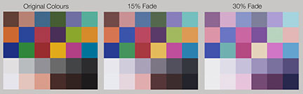
Illustrated below is the difference between 15% fading and 30% fading. Can you tell the difference?
Printing / Truth in Advertising
Kodak actually tell us that 30% is conservative and that fading of 60% or higher can still fall into the “acceptable” category.
Some experts cite that these far less stringent test methods could make up to a 15 times difference in estimated print life compared to the standard methods used by the rest of the industry. For the quoted “Archival life of 150 Years” we potentially should be reading just 10 years by the generally accepted standards.
To make matters even worse Kodak (and therefore many pro labs and photographers) often advertise a figure of “200 years*” for their prints. The “*” then refers to “Dark Storage”. This 200 years they cite comes from testing prints in effectively “perfect” conditions – totally dark, dry and cool, and then waiting for them to fade by 30%. Pity Australia is mainly hot, humid and bright.
Even as I write this (Nov. 2014) I see a major pro lab in Australia have on their website an unequivocal statement that:
“All of our traditional Photographic lustre and gloss prints are exposed on Kodak Professional Supra Endura VC Digital Paper which has an archival life of 200 years.”
Not even the asterix* to qualify that this is Kodak’s figure for complete darkness!
Our opinion is that to fade by 30% in 200 years in perfect storage conditions is actually a terrible result. As ridiculous as it sounds (and who would really know) from the best we can work out, under the same conditions a good pigment print on a quality art paper would take something like 6000 years to fade that amount in those same conditions.
Imagine if this was the motoring industry and one car manufacturer attempted to use test methods that gave fuel consumption figures that were 15 times greater than what the standard methods showed! The key difference is obviously with fuel economy you would know in a week or so, whereas with prints fading it may be 1 year at worst or more typically around 10 years before fading starts and then continues to become an issue.
This lack of standards, dubious marketing and wildly different testing methods makes it understandable why the public struggle to have any real form of understanding of the true state of play in print life today.
-
What is acceptable fading?
It is not just the way testing is done but also the extremely important question of what is actually considered “faded” that plays a huge role in advertised print life. When testing print fading the term “endpoint” is often used to describe when a print has faded. If you were allowing 10% fade as acceptable you would say you were using a 10% endpoint.
As mentioned in our preceding section, in very simple terms at Aardenburg Imaging they use an average allowance of 10% tonal fade and colour shift as their “acceptable” fading which also includes an allowance for the worst 10% of sample patches to shift by a slightly larger amount (20%)
Kodak’s own Endura white paper on print life express fading amounts in the following manner: 20-30% as “noticeable but not objectionable”, 30-60% as “acceptable” and above 70% as “most prints to be marginally unacceptable”.
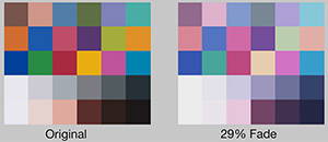
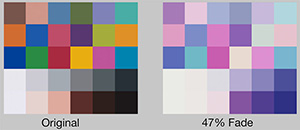
When it’s just numbers presented in an apparently rational and reasoned manner it can be hard to grasp what these amounts look like. We have sourced from Aardenburg Imaging some of their published results to look at two figures, 29% fade and 47% fade.
This is what 29% fading actually looks like (falling within Kodak’s “noticeable but not objectionable” category.)
Below is an example of 47% fading (the most faded image we could find). It falls well within the 60% fade amount, which Kodak describe as “would not be objectionable”.
Kodak goes on to say that “levels above 60% fade can still be considered to fall within the acceptable category”
We have had trouble finding test results with amounts of fade above 47%. When Kodak say amounts of fade above 70% fall into a category of most prints to be “marginally unacceptable“ we will have to leave it for you (and us) to visualise.
The only conclusion we can draw from Kodak’s published data on the topic of acceptable print fade is that it seems that rather than asking experts, collectors or artists opinions, they seem to have gathered a group of people that appear to have an amazing tolerance for actual print fade with prints that have little emotional or financial connection.
Kodak have published that “most prints to be marginally unacceptable” when faded by more than 70%. This gives the almost unbelievable inference that their test group found some prints were still acceptable when less than 30% of the image was left on the paper. It almost feels like you are reading the dialogue from a Monty Python sketch.
To then use these remarkable results as the basis for sweeping statements of when a print is “faded” that then get factored into their advertised archival ratings and technical papers is part of the reason for worldwide confusion on the topic and makes you wonder how to take seriously any points they make on print life.
The typical reaction of photographers and galleries when actually seeing the true difference in the actual fade rates between C-Type prints and good Pigment prints is consistently one of first shock at the results and then surprise that these differences are not widely publicised. This is often followed by frustration that in situations where there are important images involved that they have been effectively misled by many of the major labs around Australia.
At High Res Digital, we rely on the results of fully independent Aardenburg Imaging and to a lesser extent Wilhelm-Research (you don’t get to actually “See” any of their test results) for unbiased information when assessing print life, and have extreme skepticism of anyone quoting one brand’s in-house test results.
-
At High Res Digital we print for many major galleries and artists and the simple fact is that many people who pay large amounts for fine art photos, hang them in spaces that are often brightly lit.
We have had collectors tell us that they are now prepared to pay more for photographs if they are good pigment prints – as they now can consider them a permanent work of art, something that they do not consider C-Type prints to be.
Whilst writing this we were once again approached by one of Australia’s leading photographers who needed us to re-print a series of works owned by one of Australia’s major Art Institutes. The original prints were carefully and professionally printed C-type Prints, professionally framed and almost 15 years old. They had been both stored and displayed in normal conditions. They have now faded to an unacceptable level.
This is a story we are hearing more and more regularly from collectors and institutions and are sure it will become a more frequent issue as times goes by.
In 2010 the respected journal The Art Newspaper ran a story titled “C-prints fade into the light” on valuable photographs fading, including works by Gursky – even when mounted in protective plexiglass.
Another independent insight can be gained from the display advice offered by the American Institute for Conservation to major galleries around the world for displaying photographs.
They recommend that for C-type prints that they should be displayed under light no brighter than 50 lux and for a total of 12,000 lux annually. For pigment prints the recommendation is for no brighter than 150 lux and for a total exposure of 84,000 lux annually.
-
We are constantly asked “how long will this print last?” and we have to follow the question with “it greatly depends on where and how you hang it” Following is a table from Aardenburg Imaging showing the significance of light levels on print life. (We have a Lux Meter available to test exact brightness levels you may wish to check). Other important factors in print life are things such as air-bourne pollutants, ozone and humidity. Framing prints behind glass or perspex help eliminate these environmental issues as factors in print deterioration.
This chart from Aardenburg Imaging helps show the huge factor display conditions have on print life.
Lightfade Hours TableIn simple terms the numbers across the top refer to the total amount of light received by Aardenburg Imaging Charta print. If you look down the columns you will see the red numbers showing the number of years it takes to reach that amount of light.
The idea is that if a print “fades” at the 20 megalux point you would then look down that column to see its expected print life in various lighting situations.
We have circled two figures in the 20 Megalux-Hour column. The first – 91 represents 91 years expected print life in standard Museum conditions of 50 Lux of light for 12 hours a day. The second – 10 represents 10 years print life in a standard bright home or office conditions of 450 Lux for 12 hours a day. Other figures on that same column show an expected life range from 228 years in a darkened hallway to just .5 years if getting direct sunlight through a window.
In terms of print types being done today, Kodak Endura would “fade” between the 10 and 20 Megalux-hour amount, Fuji Crystal Archive around the 30 Megalux-hour amount and a good art paper printed on an Epson 9900 at around the 140 Megalux-hour amount.
-
Machines such as Lamda and Lightjet printers that produce C-Type prints were very expensive to buy yet are relatively cheap to run. For any lab that already owns such a printer it is obviously in their own interest to promote C-Type prints as they are a very profitable print type, and quite understandably labs do not want their expensive machines to become redundant.
For many customers where a long print life is not a requirement then C-Type prints are still an appropriate option.
When manufacturers name products using words such as ‘Endure” and “Archive” in their product names and then list and advertise archival figures of 150 years or more it is easy to see how labs and consumers are left with the impression that they are dealing with an archival product. Given it does take some time before fading becomes noticeable, some photographers or artists may even have stopped selling work before problems arise.
We have had photographers tell us that their labs C-Type prints were much more archival than pigment prints. When questioned it is always the same answer – their lab has quoted to them Kodak’s in-house figures of 150 years etc – under independent tests using the industry standard methods the results for Endura is more like 10 years. As mentioned in our preceding sections – all independent tests show good pigment prints to be incomparably more archival than all C-Type prints, typically having between 5 and 20 times slower fading and colour shifting rates.
About the only things a C-Type print outperforms a good pigment print on today is for super high gloss prints and that they are more durable to abrasion – If that is your prime requirement, then that is an educated decision, but if you choose on print life, availability of art papers, largest colour gamut, blackest blacks, paper widths and weights, environmental credentials etc. then good pigment pigments have well surpassed C-Type prints
-
Photography we hope will be around forever. Many of the early photographic processes produced images that in many ways became more beautiful as they aged – producing rich sepia colours, lovely patinas etc. You could say they aged gracefully.
Unfortunately you could say that C-Type prints fade in a very ‘ungraceful’ manner. Significant fading, typically to an ugly weak pink or blue colour turns once desirable prints of value to prints that in most discerning viewers judgements are not fit for showing.
Many galleries around the world are seeing extremely valuable prints fade and now request pigment prints as their exhibition print of choice.
When pigment prints do actually fade they typically do not have anywhere near the associated colour shifts of C-Type prints.
Many people feel that C-Type prints – chromogenic dyes in plastic paper appear to have had their time as far as exhibition prints and more particularly prints for sale go.
-
Whilst it may seem obvious, it is not as simple as it sounds. For most images it is fairly straightforward: pleasing to the eye, nice structure, good transitions, accurate detail and colour etc. For many of our clients – particularly the more abstract artists we work with, to them a good print may be the exact opposite of any or all of the preceding features.
To us the primary goal is to produce a print that meets our client’s vision, as abstract or visually obscure as that may turn out to be on occasion! We are often asked by established artists to match older, editioned work that has been produced by methods either no longer available or to step an edition on from C-Type to Pigment production. Again in these cases typically a good print is one that visually matches what was previously produced, not necessarily the “best” print that you can do.
-
Salt 304 © Murray Fredericks. 420cm x 120cm. Hamiltons Gallery, London.
Small prints are far more forgiving than large prints. Just how big an image can be printed is also influenced by a number of factors apart from just how good and big the original image is. Subject matter, final viewing distance and personal expectations all play a part.
It is when significantly enlarging images that issues start arising. We specialise in optimising files for enlarging, particularly small or problem files, putting great effort into appropriate sharpening and noise/structural balancing.
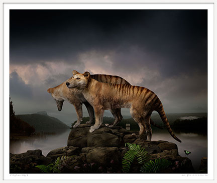
Thylacine Study Three © Joseph McGlennon. 192cm x 162cm. Michael Reid Gallery, Sydney
One of the issues that does not show up in small prints but regularly becomes apparent when enlarging beyond a files natural maximum size is the way digital cameras deal with noise reduction. “Noise” if present in an image is typically at its worst in shadows and progressively becomes less apparent through midtones and normally disappears in highlights. When first dealing with this issue we were perplexed by having to fix images having smooth highlights and shadows but “noisy” midtones.
Noise reduction be it in camera or via your image processing software typically is most targeted at the darkest parts of images and progressively gets less through the lighter tones. What we often see in significantly enlarged images is the point where the noise reduction has had difficulty knowing exactly when to stop. This is perfectly understandable, it is a very complex issue – where and when should noise reduction be applied to what degree, and at which exact tonal point does it not need to be applied anymore? Our job is to make the structure of the image even from highlight though to shadow – this gives a more natural and pleasing look to the eye.
There are many plugins for Photoshop that automates the enlarging part of the process, such as Perfect Resize. We have these options but rarely use them – they are great for signage prints but can introduce an unrealistic structure to the image and will often also introduce problems to areas of the image with smooth transitions (such as skin tones).
To get the most photo realistic result we use a variety of Photoshop’s tools, we have done this for many years on almost a daily basis and are known for our ability in this area.
As mentioned there are many factors that will ultimately decide just how big you can realistically go. We have done an optimised enlargement to produce 2 metre prints from images shot on a 10 megapixel compact camera, that were then successfully exhibited and ultimately purchased by one of Australia’s major art institutions.
Having printed many group exhibitions where images by different photographers are side by side, some shot on large format film and some shot as small digital files we have gained a reputation for being able to produce a coherent “film like” look from a range of originals.
Below shows part of the “Reportage a Retrospective” exhibition held in Sydney in 2010. It included images from a large number of photographers, covering the period from 1999-2009. All images were printed 120cm high by whatever width they happened to be. Some were on medium format film, one image of George Bush and John Howard was from a 4 megapixel digital camera that had to be printed 120cm x 160cm. We (hopefully) were able to make it fit in with the other images and work effectively as part of the show. (The hardest part was not so much the enlarging and structure work but removing the embedded sharpening halos!)
Reportage a Retrospective © Michael Amendolia
-
Everyone wants to have a successful exhibition and success can be measured in many ways. Whether it be your first show or just your latest, we will endeavour to help you in any way we can. From advice on image selection, help in the overall look of your works, image editing, optimising and final finessing, to paper choice, prints sizes, border sizes, framing options, gallery options, edition sizes – the list goes on and on.
We print successful exhibitions for successful photographers and artists on a constant basis and have a thorough understanding of the whole process. We will make sure your works look as good as possible and for those new to the process we will make sure your works are something to be proud of.
We have printed the winners of virtually all of the major photography prizes in Australia, many of them multiple times. If you need a prize winning print done, we will do our very best to help you with that goal.
-
The very good news is that our premium prints – Pigment prints on acid free cotton rag art paper are not just beautiful and the most archival of all but they are extremely environmentally friendly. No cotton is specifically grown for the making of cotton rag art papers. Cotton papers are typically made from either recycled cotton rag or the “second cut” of the cotton – the primary first cut is what the textile industry requires and the prime purpose that the cotton is grown.
Cotton Rag Art papers get a 5 out of 5 for their “green” credentials.
No water is used in the printing process and at High Res Digital we recycle our ink cartridges, packaging and all test prints and off-cuts. We also use biodegradable bubble wrap when packing prints.
Artwork Reproduction
-
We have been copying and reproducing art for over 40 years and since 1996 have been at the forefront of digital reproduction. Our main 396 megapixel camera uses specially imported lenses and can produce single images of up to 2 gigabytes in size. For copying artworks we use the the highest quality combination of specialised lenses, digital backs and cameras to copy works up to 300 x 500cm. When needed we use customised stitching technology and multiple captures to produce “uninterpolated” files in excess of 50 gigabytes. This achieves highly detailed wall size enlargements of even small paintings.
We can copy artworks of all sizes, we also do digital restoration – often in collaboration with Australia’s leading art restorers.
We use a variety of lighting techniques to produce the best interpretation of an artwork. Our standard lighting uses 1 metre sized polarising filters over our light sources with a crossed polarising filter on the camera. This is varied to whatever extent is required to help achieve accurate reproductions and minimise light reflections – particularly for the reproduction of oil paintings. Heavily textured works, works with foils or metallic elements may often require variations or combinations of copying techniques to accurately represent the work, this is something we specialise in.
Apart from the quality of our scanning and printing, many artists particularly enjoy that the fact that we can copy the artwork, prepare the file and print it in the one premises. We have a wide range of paper and canvas stocks. We copy paintings of all sizes, editioned prints can be smaller or larger than the original work (our largest archival stocks are 1620mm rolls).
We produce limited edition prints for many artists. Depending upon which materials an artist has worked with, our prints are often more stable than their originals. Some artists often only sell our prints and not their original works.
We can manage your prints, hand deckle edges, ship, emboss etc as per your requirements.
-
There are many circumstances where a high quality reproduction may be required of an artwork. Museums and galleries may tour an original work and need a replacement print. Investors with particularly valuable works that are stored away may wish to hang a reproduction rather than the original for security reasons. Some clients want a copy of a work if they are thinking of selling it and some may simply want an extra copy for another of their homes or offices.
Due to copyright laws, generally all of these copies above must not to be resold.
-
If you have a painting that cannot be moved, in most cases High Res can come to you. Contact us for a custom on-site photography quote.